Effective web design is the delicate balance between visual aesthetics and practical functionality. When building a website, beauty without usability leads to high bounce rates, while utility without style fails to build emotional trust.
To build a high-performing digital experience, web designers anchor their work around five core fundamentals.
1. Intentional Purpose and Simplicity
Every page on a website should serve a clear, defined purpose—whether that is capturing leads, selling products, or educating the user.
-
Reduce Cognitive Load: Clutter overwhelms visitors. Keep layouts clean and focus heavily on negative space (whitespace) to let elements breathe.
-
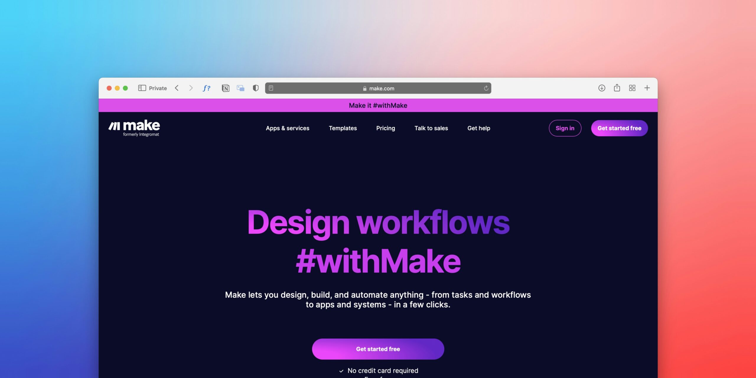
The 3-Second Rule: Within seconds of landing on your homepage, a user should instantly understand who you are, what you offer, and how it benefits them.
2. Intuitive Navigation and Information Architecture
Navigation is the roadmap of your website. If users have to guess how to find your content, they will leave.
-
Keep it Predictable: Stick to standard conventions (like placing the primary menu at the top). Limit top-level menu items to a manageable number (ideally 5 to 7).
-
F-Shaped and Z-Shaped Scanning: Web users typically scan text in an F-shape pattern (left-to-right, top-to-bottom). Structure your layouts to honor these natural reading habits.
3. Visual Hierarchy and Typography
Visual hierarchy dictates the order in which a human eye processes information on a screen.
-
Guiding the Eye: Use variations in size, weight, color, and contrast to establish a clear focal point. Your main headline should always command the most attention, followed by subheadings and body copy.
-
Legible Typography: Limit your site to a maximum of two or three complementary font families. Ensure high contrast between text and background colors for optimal accessibility.
4. Responsive, Mobile-First Design
With the majority of global web traffic originating from mobile devices, a responsive layout is non-negotiable.
-
Fluid Scalability: Websites must adapt fluidly to any screen size—from giant desktop monitors to compact smartphone screens.
-
Thumb-Friendly Interaction: Buttons and touch targets must be large enough ($44 \times 44\text{ pixels}$ minimum) to tap comfortably without accidental misclicks.
5. High Performance and Speed
Design is heavily tied to technical execution. A visually stunning website loses its value instantly if it takes too long to load.
-
Speed Equals Retention: Nearly half of web visitors will abandon a site if it takes longer than 2 to 3 seconds to load.
-
Optimization: Compress high-resolution images into next-gen formats (like WebP) and minimize unnecessary code bloat to keep performance lightning-fast.